Agency:
Client:
Anto’ is a traditional Italian canned food brand, launched in 2011. The economic downturn in Europe pushed consumers towards canned and preserved food products, but this also meant more competition for the new, small company. They lacked a distinctive identity, and needed to strongly convey the quality and originality of their products as this was important to their target market.
Agency:
Client:
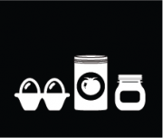
Church & Manor were a truly unique class of eggs, with market-redefining potential. But accessibility issues were preventing them from realising this ambition. With warning lights flashing over this speciality range, Noble Foods found themselves in need of an eleventh-hour rebranding. Facing an oversaturated market locked in a state of a decline, Springetts were chosen to help these golden eggs really shine.
Agency:
Client:
The beautiful story of Ragú’s humble beginnings had never been shared with its consumers. So when Symington’s acquired the brand in 2011, they immediately set about emphasising the Italian-American heritage of the sauce, in an attempt to recapture a waning market.
Path undertook this sizeable rebranding project, delivering assets across the board. With a more traditional and user-friendly jar, a simplified design style, and a stirring tale of heritage brought to the fore, Ragú reappeared in the market ready to achieve its vast ambitions.
Agency:
Client:
Trewithen Dairy is a small Cornish dairy farm looking to maintain a truly local following and local sustainability, while also building a national listings portfolio.
Agency:
Client:
The green and gold of Lyle’s Golden Syrup are the hallmarks of Britain’s oldest brand. The tin has remained practically unchanged for over 125 years. When Tate & Lyle Sugars decided on a limited edition pack to celebrate the Queen’s Diamond Jubilee, they needed a design that would stay true to their heritage while making consumers smile.
Agency:
Client:
Bart’s Spices has been a premium producer of herbs and spices since 1963, but there was relatively little awareness of the brand despite its longevity and 20-year presence in Waitrose retailers. In 2012, the company rebranded as ‘The Bart Ingredients Company’ and Honey was commissioned to develop a new design for its new and existing product range.
Agency:
Client:
Only 7% of households cook duck at home, and Gressingham Foods was struggling to sell their duck in supermarkets. Against a background of rising production costs and a brutal trading market, it became apparent that the brand and the category needed rethinking.
Agency:
Client:
The bistro Eat 17 began preserving their signature burger topping and selling it to customers. Because it was an unfamiliar product and its speciality ingredients demanded a premium price to make profits, Eat 17’s Bacon Jam needed a complete overhaul. This is where Together Design stepped in.