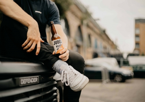
Fruit-infused beer Jubel was being placed in the mainstream lager category, but a new brand strategy, identity and pack design helped realise its ambitions to be recognised as a premium, craft beer. Repositioned and redesigned, the brand established a strong foothold in the craft beer segment, where it’s been driving category growth.
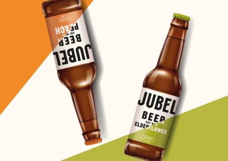
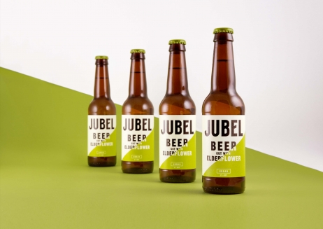
Centering around the idea of ‘breaking through the mundane’ and incorporating craft category cues, the new design by Pearlfisher offers a more emotive brand experience. It stands out on shelf with a striking ‘cut through’ device; a nod to Jubel cutting through the beer and cider categories and also symbolic of the brand’s unique flavour infusion and ‘après ski’ roots.
Manifested across the packaging and all comms, from website to posters and social media, the bold design and upbeat tone of voice helped Jubel smash year one distribution targets by 272% and 20,000% in the on and off-trade.
Sainsbury’s listed Jubel in the craft beer category due to the redesign, where its driven incremental value sales of 62% for the retailer. And with the brand achieving an increase of 184.5% in sales revenue in the year following rebrand, Jubel employed an extra seven people to keep up with the increased demand.