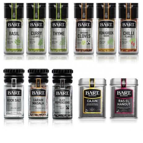
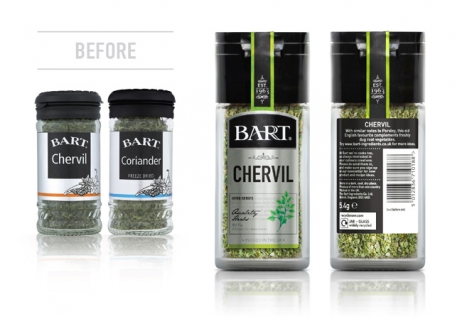
Bart’s Spices has been a premium producer of herbs and spices since 1963, but there was relatively little awareness of the brand despite its longevity and 20-year presence in Waitrose retailers. In 2012, the company rebranded as ‘The Bart Ingredients Company’ and Honey was commissioned to develop a new design for its new and existing product range.
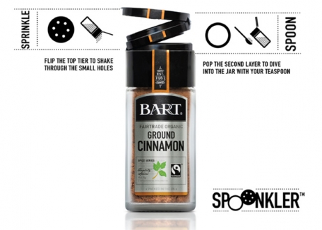
Research found that more people are cooking with fresh ingredients and seeking inspiration in the kitchen. Capitalising on this trend, Honey developed a sophisticated pack design that reflected the high quality of the product. They modernised the logo with bold font and silver finish, and incorporated plant illustrations to distinguish between products. The addition of clear user instructions also makes the products feel accessible to more modest chefs.
In the 12 weeks following its launch, Bart’s range grew in value by 42.5% and its household penetration improved by 22.8%, outperforming every competitor in the market.