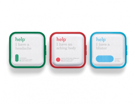
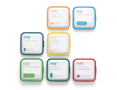
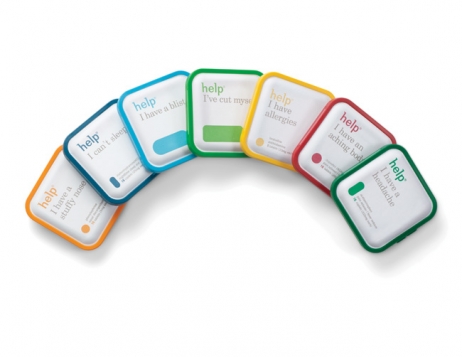
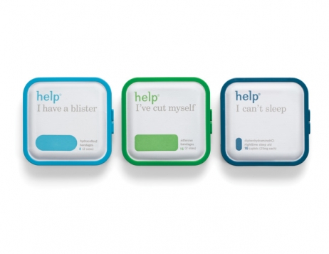
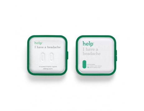
Launched in 2008, Help Remedies wanted to challenge the stagnant messaging and negative tone associated with the pharmaceutical industry. Its stripped back products contain fewer ingredients and dyes, and offer a remedy for every common ailment from a headache to a blister. But in 2010 they still hadn’t made the impact they had aspired to. That’s when they commissioned Pearlfisher to emphasise the brand’s unique ethos and nurturing personality through a new design.
Dialling up Help’s point of difference through clear iconography, Pearlfisher introduced colour-coded products, more striking fonts and clearer product dosage. The result was an impacting design that stood out on a crowded pharmaceutical aisle. The minimalist medical brand became instantly recognisable and its ‘less is more’ philosophy finally caught on.
The success of the redesign was colossal. Help’s sales increased by 1000% in the first year and its distribution improved by 150%. It was recently acquired by Remedies LLC, which now plans to internationalise the brand.