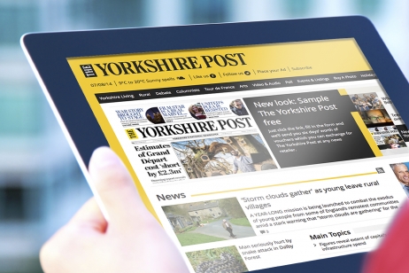
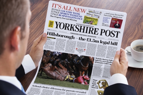
Changing consumer habits and growth online has evidently resulted in challenging times for printed press, and having suffered declining sales with reduced advertising revenue, The Yorkshire Post (YP) had downsized and relocated to smaller offices. Success was going to be critical to the paper’s future survival, therefore a brave step was taken to rebrand and reposition YP to widen its market appeal.
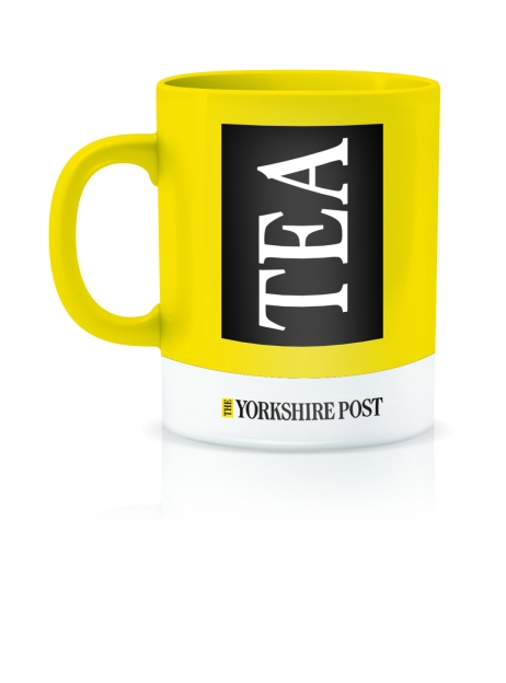
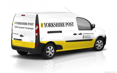
Following a strategic review and the subsequent rebrand which included putting the ‘The’ back into the brand name and introducing yellow to the logo for increased visibility, YP experienced a reverse in its long term sales decline, with newspaper sales up over 6000 per week and online visits up 44%. By creating a perception of relevance and added value, YP was even able to increase its price by 10p after re-launch and still maintain robust sales. Importantly, after three years of redundancies and cuts, the new identity gave staff a real boost.