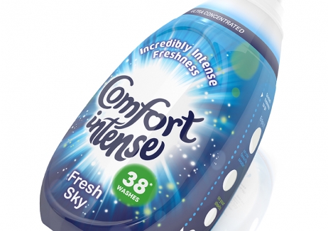
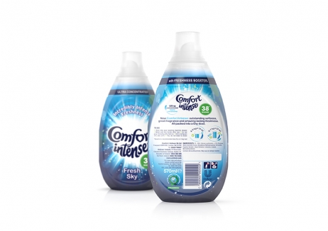
Comfort faced a challenge with its new ‘Intense’ ultra-concentrated fabric conditioner. It has a price premium but comes in a pack that’s less than half the size – meaning the packaging design would have to work twice as hard to communicate the strength and intensity of the product within to justify the price.
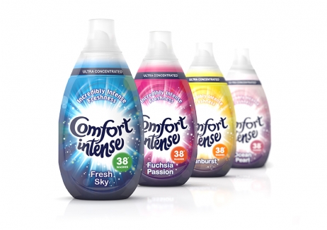
A new logotype that locked together ‘Comfort Intense’, set against an ‘explosive’ graphic that represents the product was created. Each fragrance variant has its own colour, anchored against the fixed Comfort blue of the wordmark, creating a bold and confident pack that jumps off the shelf.
Since launching in 2015, Comfort Intense has helped the brand overtake its key main competitor in UK market share. This can be attributed largely to the Comfort Intense packaging, not only compared to rivals but also Comfort’s standard products: it gained 9% market share within eight weeks of launch, unsupported by TV advertising.