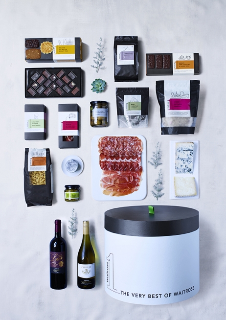
Premium food was seeing something of a revolution in light of an improving economic outlook and Waitrose was seeing competition from M&S and Sainsbury’s, as well as brands like Lidl that were increasingly focusing on quality. Waitrose 1 was created to re-energise the business’s top tier offer to encourage people to trade-up. It needed to work across all food categories – to consolidate ‘the very best of Waitrose’ under a single, clearly signposted name.
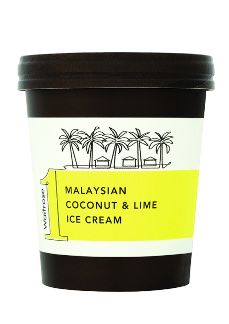
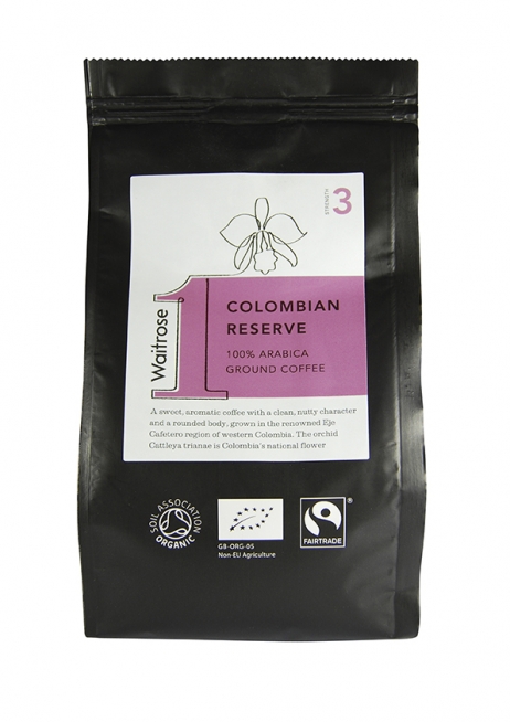
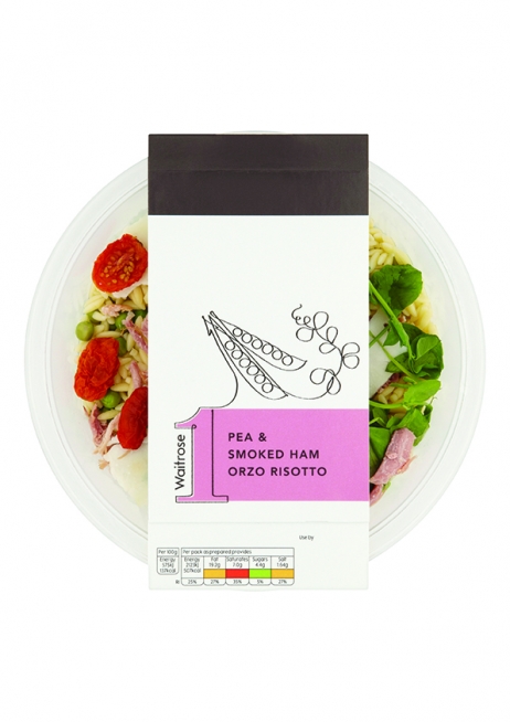
Bucking the trend for lavish food photography and ostentatious fonts, the branding and packaging design solution for Waitrose 1 tells a simple story of quality that emphasises care, time and attention. It delivers a new language for luxury, which is beautifully understated.
Launching in 2016 with a range of 500 products, the Waitrose 1 brand delivered beyond expectations in its first year. Not only has it sustained its early sales, penetration and sales are growing as it continues to inspire shoppers to trade-up, and 200 additional lines have since been added.