Contemporary dance was hugely growing in popularity and stature, and although Sadler’s Wells was driving some of this success, its brand wasn’t reflecting its progress. With theatre ticket sales declining by 2.9% across London since 2014, Sadler’s Wells wanted to use contemporary dance to attract a wider audience and increase customer loyalty.
They learnt that most of their previous communication elements had focused on performance, rather than brand, which is why their brand loyalty wasn’t strong. They needed a confident visual identity to convey the evolved organisation and unify its diverse offering.
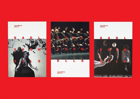
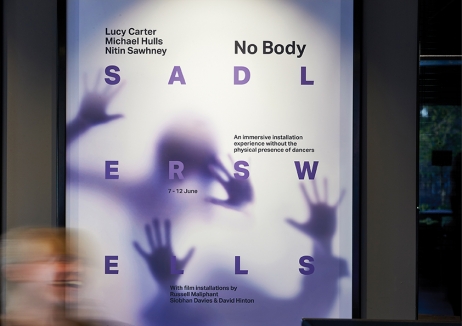
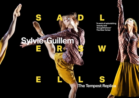
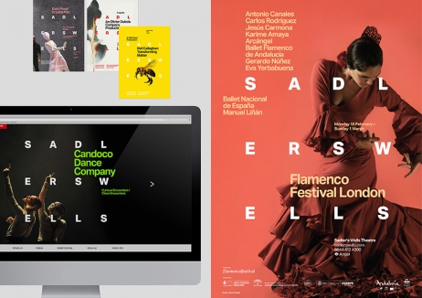
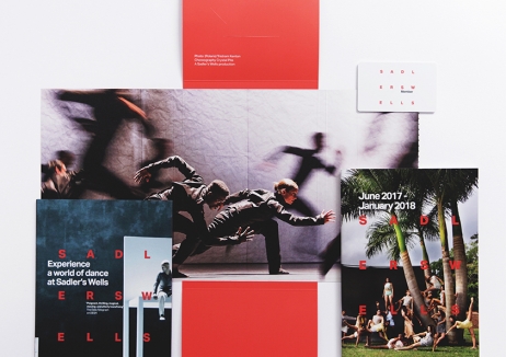
With evocative dance imagery at the heart of the new identity, the wordmark works across different backgrounds and acts as a mark of quality.
Since the rebrand, over three quarters of the audience and staff perceive Sadler’s Wells as more contemporary and ticket sales have soared. In the first three weeks, on-sale figures increased by 138.6% and there has been an overall increase in members of 28%, demonstrating strengthening customer loyalty.