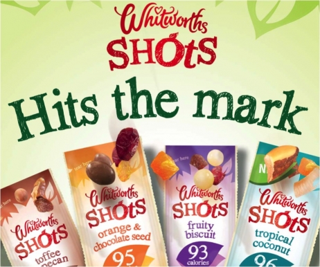
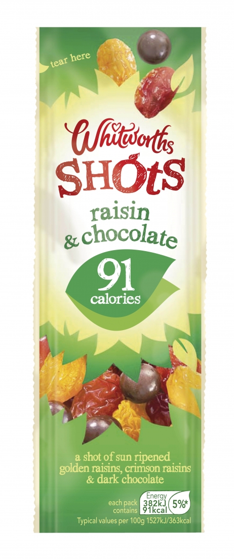
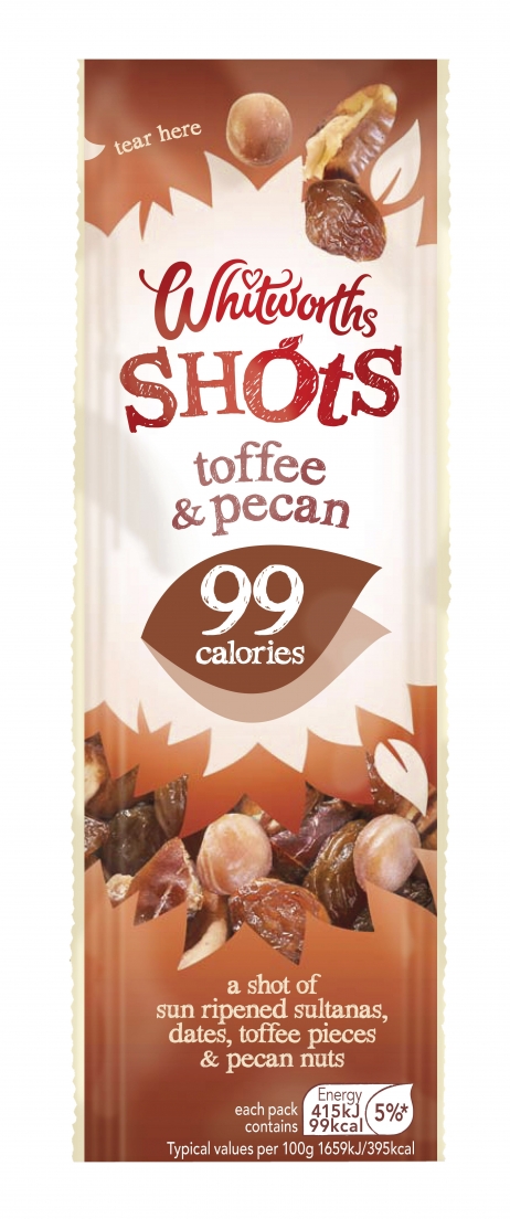
Typically marketed in the baking aisle, Whitworth’s Shots were blending in with the rest of the range rather than standing out as a snacking product. The aim was to appeal to a younger audience and to make the term ‘shots’ into a brand rather than a descriptor, in order to break onto the snacking shelf.
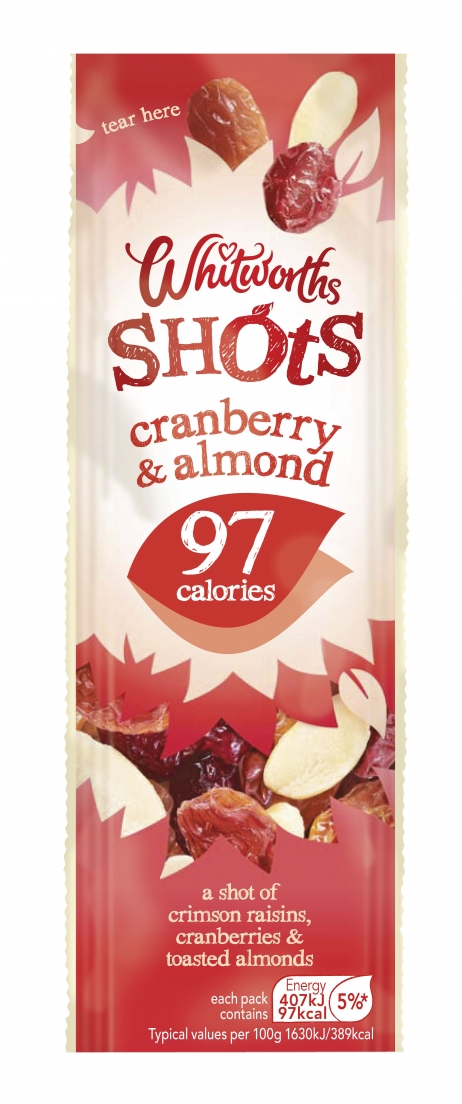
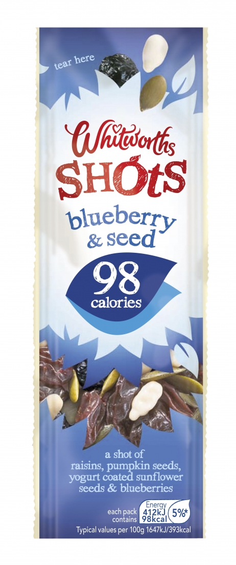
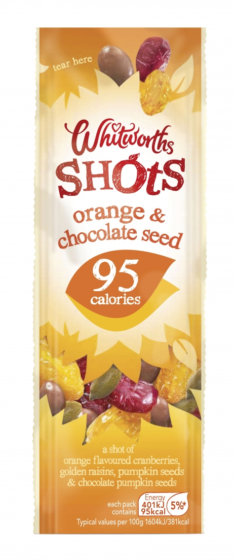
With a new positioning of ‘Burst of Nature’, the design solution brought their natural goodness to life with a leafy design architecture and playful font. A strong, fresh and natural brand look was created.
Whitworth’s have reversed their fortunes, securing the future of the brand in key retailers such as Sainsbury’s, after an absence of three years. It’s now sold at front of till locations, as well as wholefood and impulse aisles. The newly-designed Shots helped Whitworth’s grow by 47% year-on-year and the brand positioning has provided a platform for a new range called Shots Nuts.