With consumers returning to butter and sales of margarine on the slide, Flora ProActiv needed refreshed packaging that clearly communicated its healthy combination of science and nature.
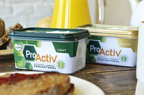
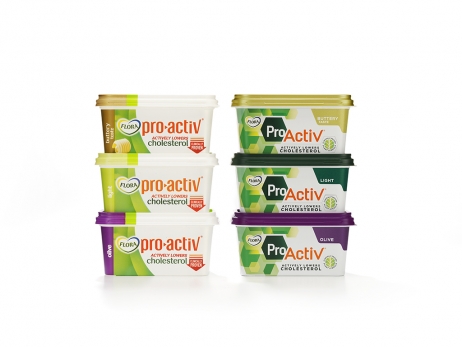
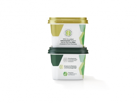
The challenge was to establish ProActiv as a standalone brand, to halt sales decline through an effective and evocative design to match its premium price. Recognising that nature works in precise patterns, the new visual identity makes significant use of hexagons, a semiotic shortcut for science in nature, and has been applied across packaging and all consumer touch points. Balanced with a colour palette of dark green, orange, silver and white, this punches through on shelves overloaded with predictable creams and yellows.
In the 7.5 months following relaunch, Flora ProActiv has arrested a steep decline in sales values with an additional 40,000kg of product sold. An extra 108,000 UK households are now using Flora ProActiv to lower their cholesterol and reduce their exposure to cardiovascular disease.