Johan Bülow’s gourmet liquorice brand achieved a stunning 139% bottom line comeback through design, despite COVID-19’s impact on its retail operations.
Lakrids by Johan Bülow is a much-loved Danish delicacy, but after a decade of growth its success was being eroded by cheaper, copycat competitors. Having experienced a 20% loss in 2018, the business collaborated with Pearlfisher to rethink the brand’s strategy and design.
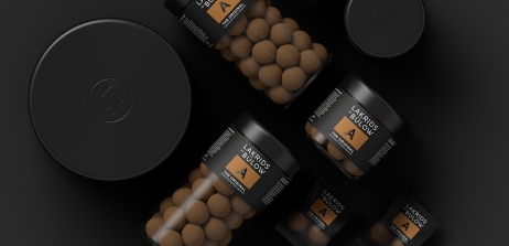
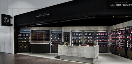
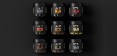
To focus on provenance, the brand’s name was shortened to ‘Lakrids by Bülow’ and a design essence, ‘every shape of black’, was developed. The new identity and packaging evolved from this, leveraging visual equities such as the colour black to communicate the brand’s quality and protect its premium price point.
Without incurring additional production costs - maintaining unit profitability - a unique new jar shape was created made entirely from 100% recycled and recyclable PET plastic. Tactile and striking, its sleek design reinforces a sense of craftsmanship, differentiating the brand.
As a result, the brand outperformed competitors following the 2019 redesign, growing turnover 16% year-on-year (versus 2% category growth). Despite key airport sales drying up due to the pandemic, international sales jumped from 53% of turnover to 63% between 2018 and 2020 and significantly, the brand has also been able to expand outside of the confectionary category.