Purdey’s new packaging helped it counter the losses it sustained during Covid, and the drinks brand grew 12.6% year-on-year post redesign.
Launched in 1988 as a rejuvenating tonic for musicians, Purdey’s had a small but loyal following as a natural alternative to energy drinks. Britvic’s plan was to grow the brand through a redesign, but as soon as BrandOpus began work on the new packaging, Covid hit and the challenge got significantly harder. Purdey’s lost half its distribution with Asda and all of its distribution with Morrisons, and sales plummeted more than 20%.
By successfully widening the brand’s appeal while maintaining its premium status, the new identity and packaging have been crucial to Purdey’s becoming more accessible. Following the design’s launch in May 2021, the brand’s penetration increased 88%. The more flexible design structure also enabled new variants, helping Purdey’s to grow share on shelf and increase distribution +20% within 12 weeks.
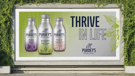
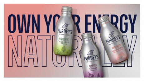
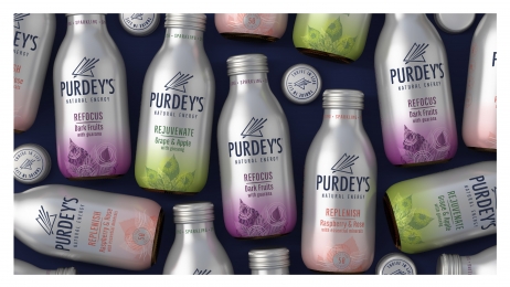
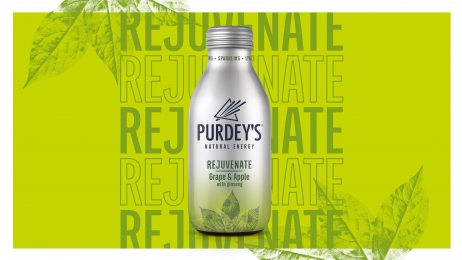
The design, which simply communicates Purdey’s key benefits, stands out with its prism icon, splashes of colour and illustrations, which also drive taste appeal. Consistent use of the metallic background across products has seen the time it takes shoppers to find the brand on a crowded shelf fall from 6.2 to 4.8 seconds. That’s much quicker than the 6.5 seconds it takes to identify main competitor Tenzing, and Purdey’s value spend per point of distribution increased to £2,100 in 2022, up from £1,500 in 2019.